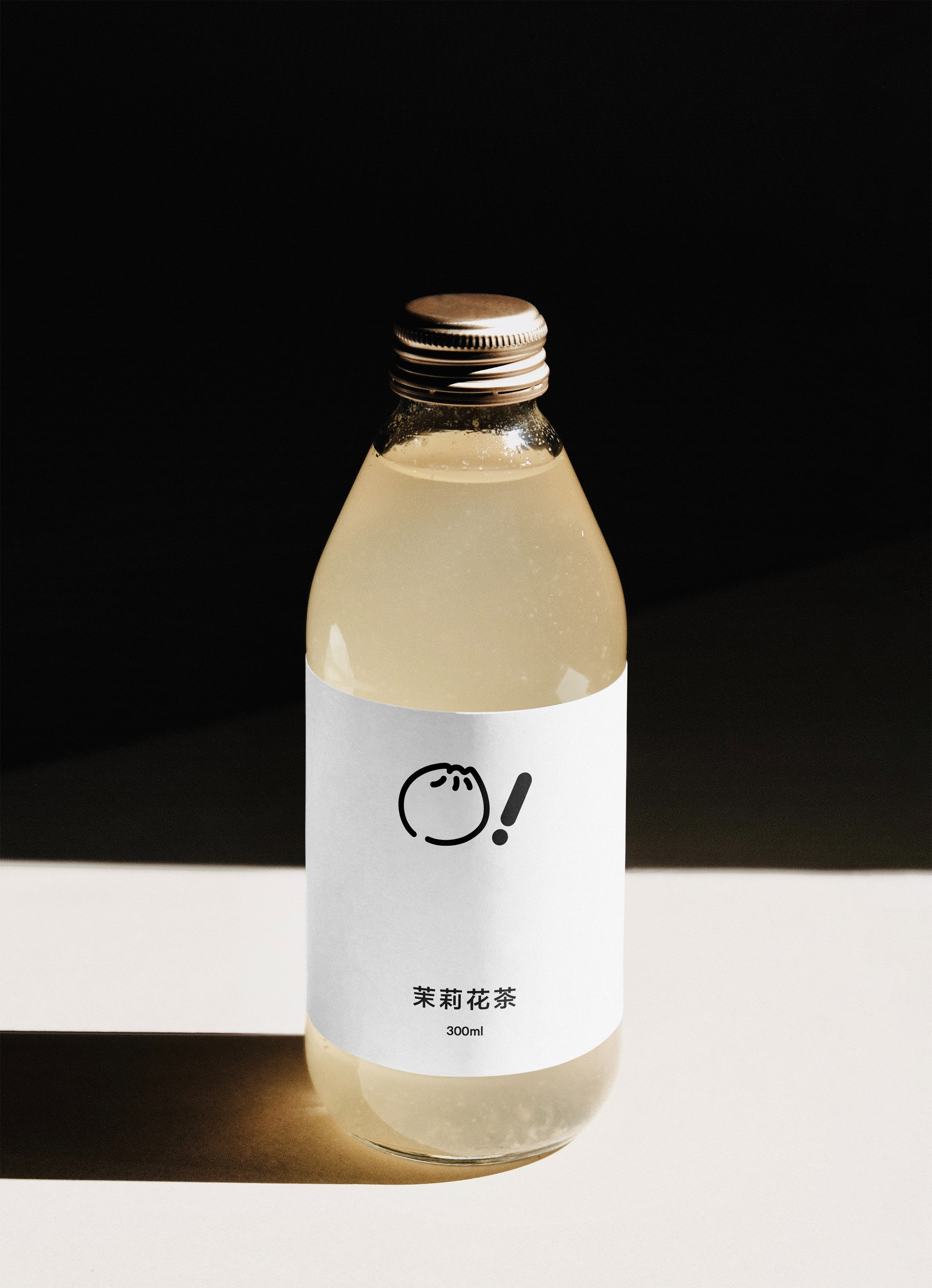
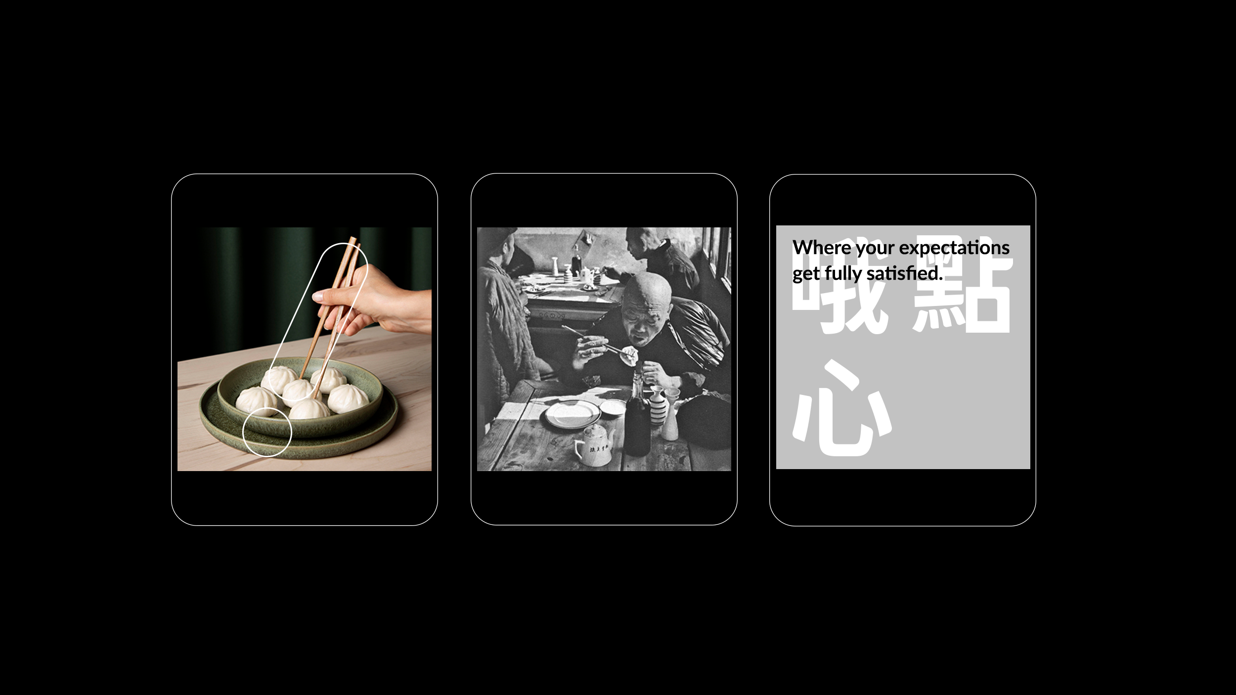
O! DIM SUM Branding
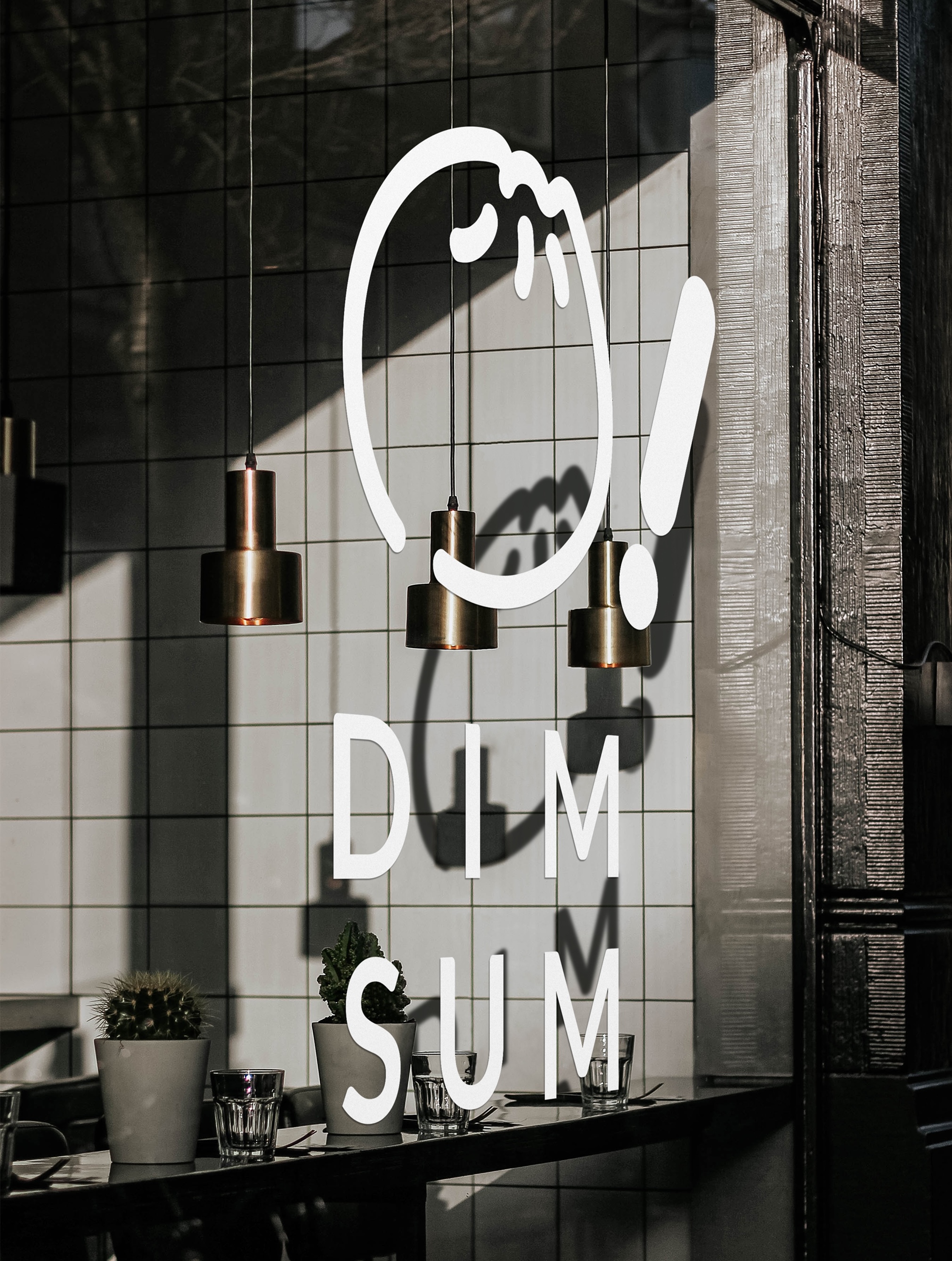
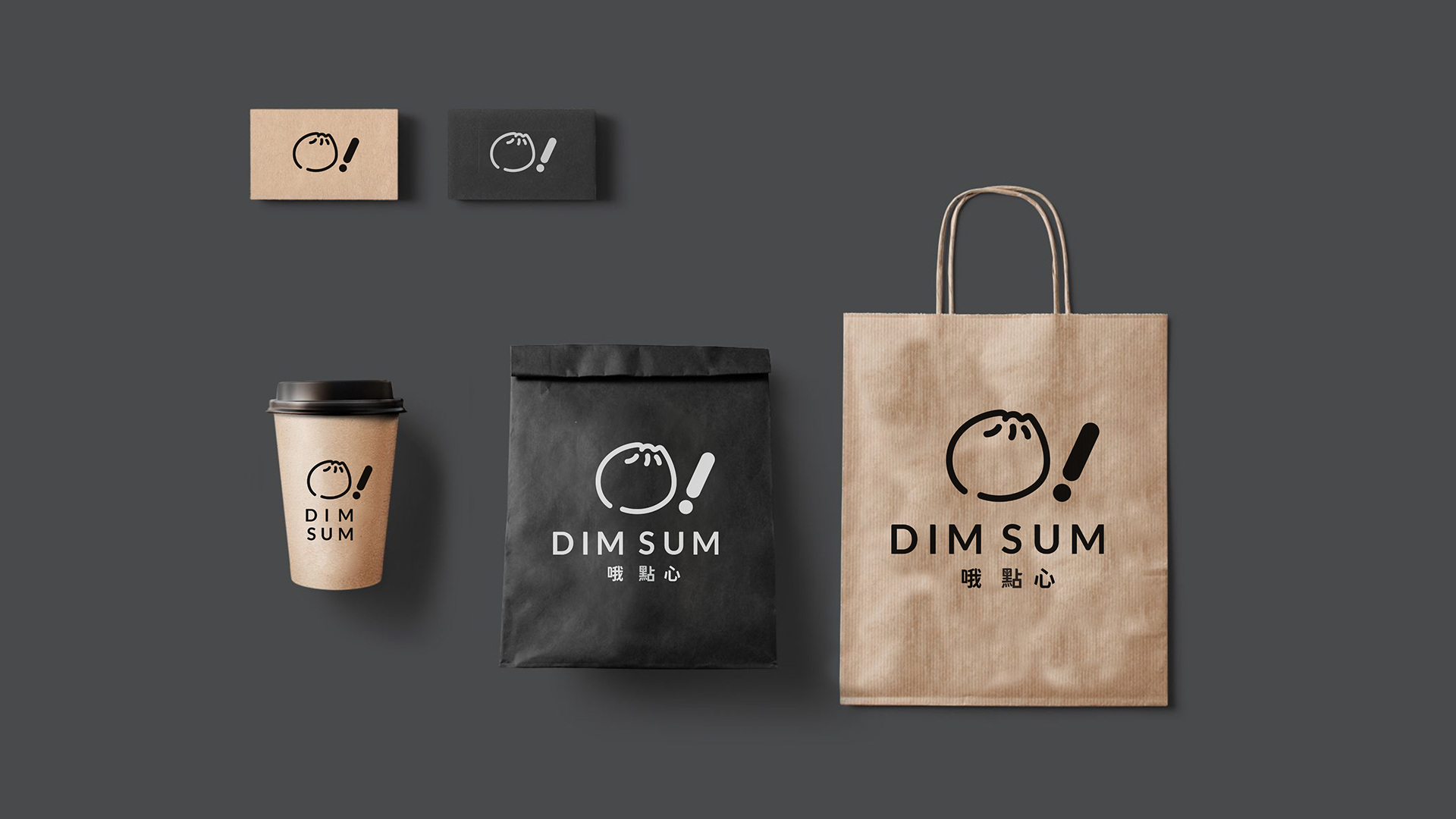
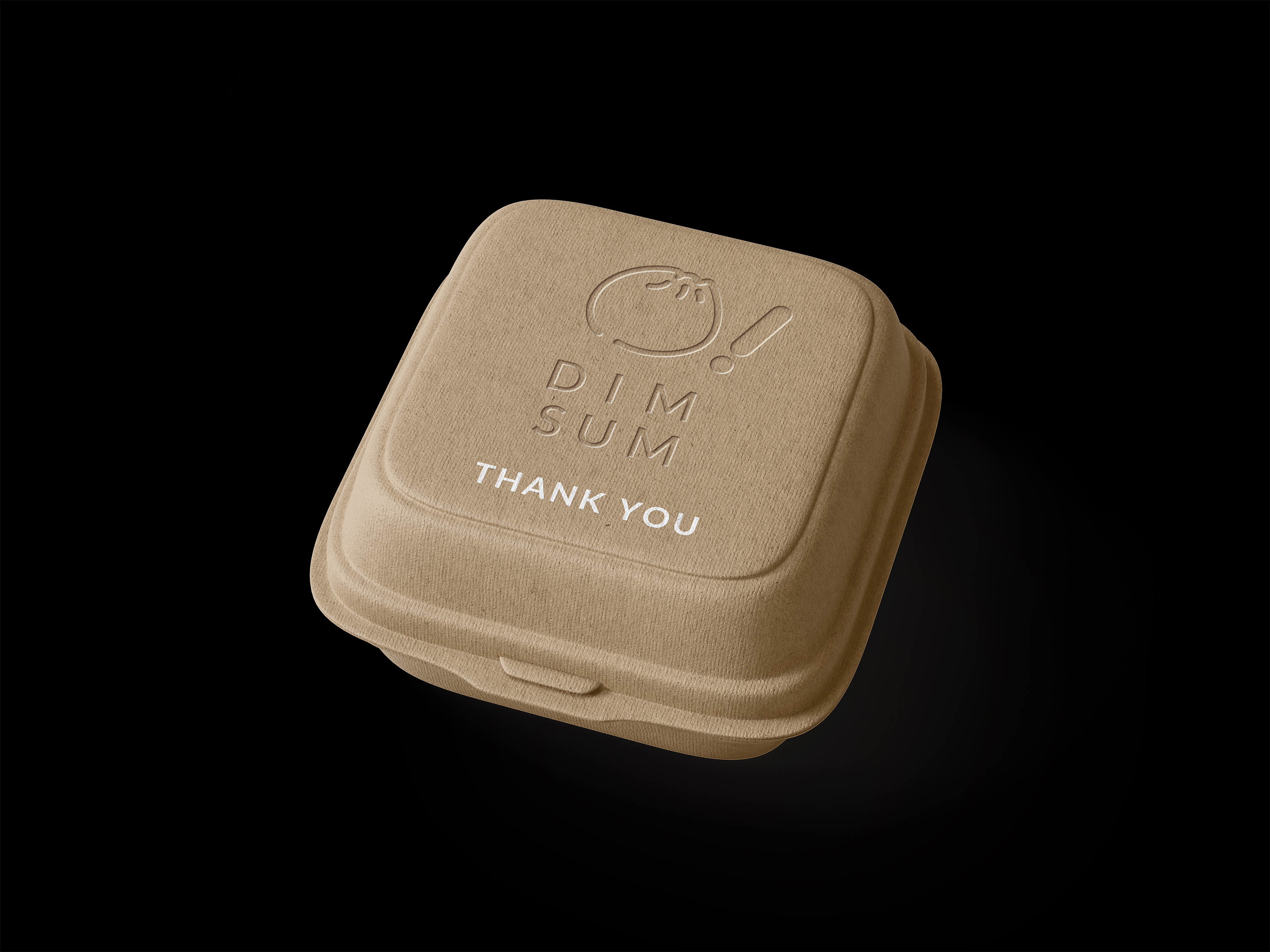
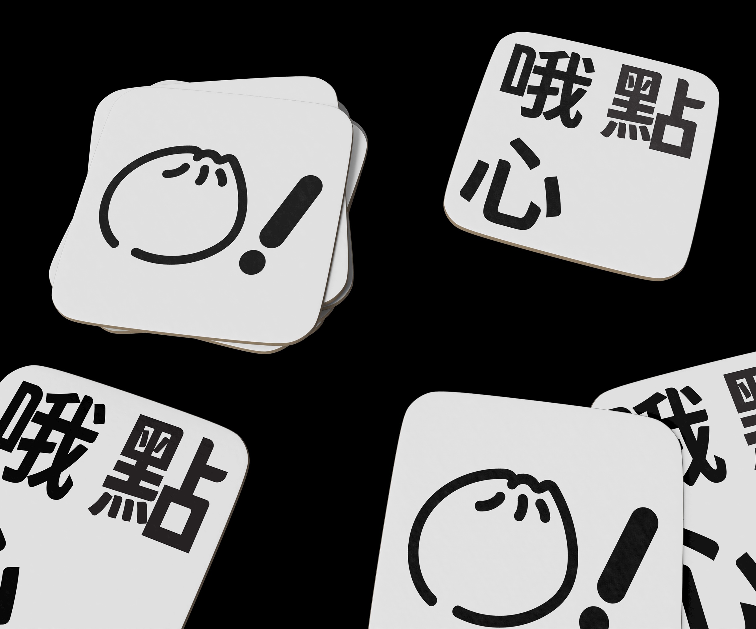
Identity design for O! DIM SUM, a restaurant specializing in traditional Chinese dim sum: small plates of dumplings and other snacks, served with tea.
The identity draws on Chinese street food culture, with an unpretentious, home-style feel. The “O!” in the name captures the small delight of discovering really good food.
Together with another designer, I created the logo, color palette, and other design assets.
Sep.2021
Brand identity / Art direction / Graphic Design
Client: O! DIM SUM
Design development: Weng Xinyu